Holland Beckett is pleased to reveal its new brand following a refresh of its core values.
The new brand was developed by design company phd3, following an exercise which Louise Beard of FORWARD conducted with the firm and its people to articulate the core values of the firm.
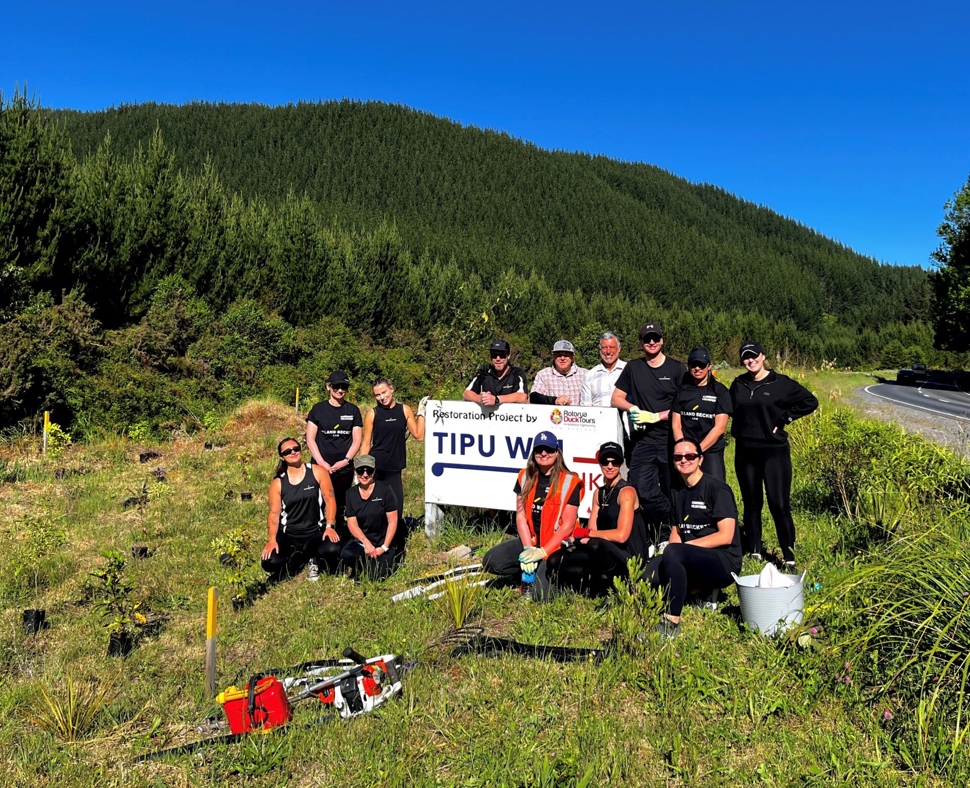
Through the value setting process, Community was confirmed as a core value of the firm, as Holland Beckett values the opportunity to make a difference in its growing and vibrant communities.
The other core values which the firm settled on are Bold and Smart as Holland Beckett considers itself bold in the way it thinks, on behalf of its clients, in the business decisions it makes, and in the way it works. The firm is also about creating and delivering pragmatic, smart solutions for its clients.
Once the values of the firm had been articulated, phd3 applied its design thinking to creating a new brand. Inspired by the Bay of Plenty region, the new brand imports a contemporary diagonal logomark that has a deep rooted significance to the Bay of Plenty area. It is a contemporary expression of a weaved thread.
This shape, which takes inspiration from traditional Tukutuku panelling and the angular land formation of iconic Mauao is representative of Holland Beckett’s values, processes and culture. The weaved thread, in its simplest form, exhibits the process of taking something quite simple and then creating something extraordinary from it.
The logomark comes to life as a gold Pīngao fibre which according to legends connects all people – tangling, stretching, but never breaking – helping individuals and teams better communicate through stronger relationships. As well as informing the weaving together of information, knowledge, individuals and specialist teams, the diagonal thread also represents the firm’s dynamism and innovative personality.
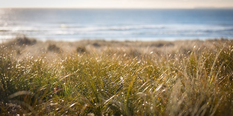
Pīngao, the native plant found throughout the Bay of Plenty, is a sand-binding plant that plays an important role in New Zealand’s dune ecosystems. Pīngao, which is regarded as a treasure, is the only fibre used in Tukutuku artwork that needs no enhancement on the brilliant gold colour it goes when dried. The colour is playful, reflecting the firm’s culture, and positive and energetic.
One of the firm’s people, Liz Scott, says she was excited when the new brand was revealed. “When I first saw the photo of the pingao (pikao) at the presentation my first thought was ‘that’s weaver’s gold’, a taonga (treasure). As a new weaver, my kaiako, taught us that pingao was only to be used by experienced weavers, it was not for beginners.”
Partner Ken Hawkes, who was part of the team which oversaw the rebranding exercise, is pleased with the result, saying “The brand is much more contemporary and one which is synonymous with being known throughout New Zealand as the region’s leading legal practice, attracting great clients and a great team.”

Sharline Fitzgerald
Tauranga


You may also like ...

High School students – legal careers information evenings
Community – walking the walk